Kells McAuliffe, Brand Systems & Differentiation
Portfolio

A designer building the systems that hold a brand together, and the details that make it impossible to mistake for anything else.

Selected workEight projects Contactkellsmcauliffe@gmail.com Scroll
§ 01

Work

01 / 08
§ 02

Index

Eight projects
§ 03

About

My name is Kells McAuliffe. I'm a designer focused on creating systems and differentiation for a range of brands.

A system is what lets a brand survive contact with the real world: a hundred layouts, a dozen channels, people who will never read the guidelines. Differentiation is what makes anyone look twice. My goal is work that does both.

Kells McAuliffe in the studio, in front of an Apeiron poster and denim jacket.
Emailkellsmcauliffe@gmail.com LinkedInin/kells-mcauliffe ↗ Instagram@kellsmc_ ↗

Apeiron

DisciplineBrandingFieldClothingYear2026

Apeiron is a fashion brand that reflects the complexity of life and embraces everyone without limitation. Its pieces are diverse yet unified by a shared identity, balancing a distinct aesthetic with fluid expression.

Challenge

Fashion labels often box people into a single fixed aesthetic. Apeiron needed an identity elastic enough to hold a diverse, ever-evolving range of pieces together, without flattening them into one look.

Strategy

Build the brand around the idea of limitlessness: a flexible system that can shift across diverse pieces, anchored by a consistent core so everything still reads as one identity.

Solution

A modular brand identity of wordmark, type system, and guidelines that balances a distinct point of view with fluid expression, giving the label room to evolve across collections while staying unmistakably Apeiron.
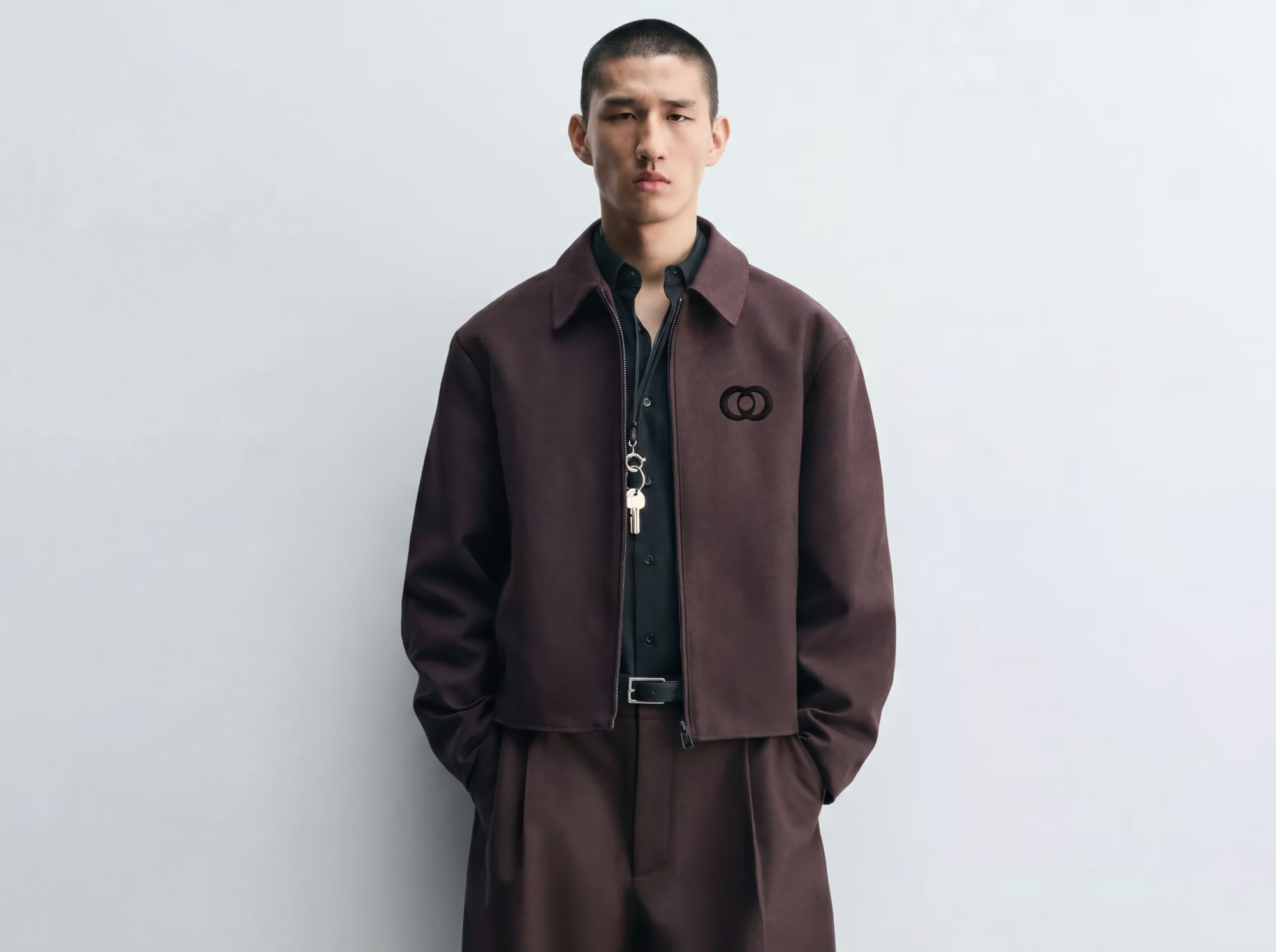
A model in a brown Apeiron jacket and matching trousers against a pale studio wall.
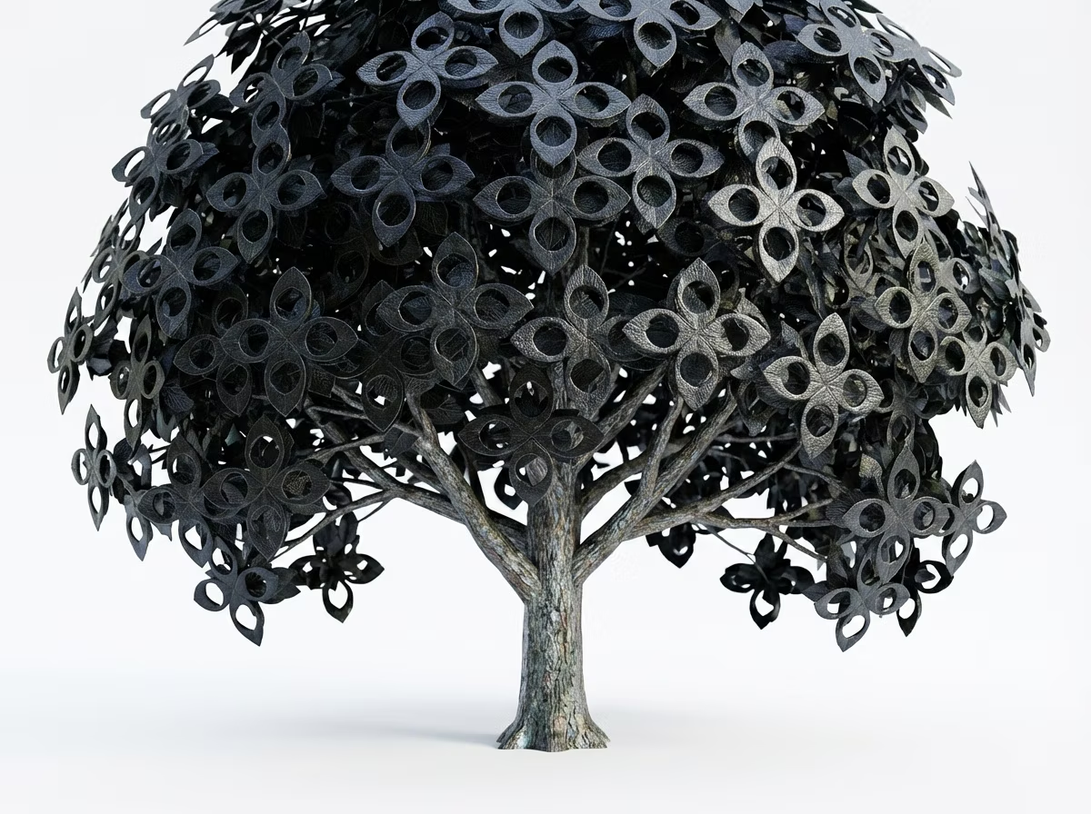
A sculptural black tree form used as an Apeiron brand image.
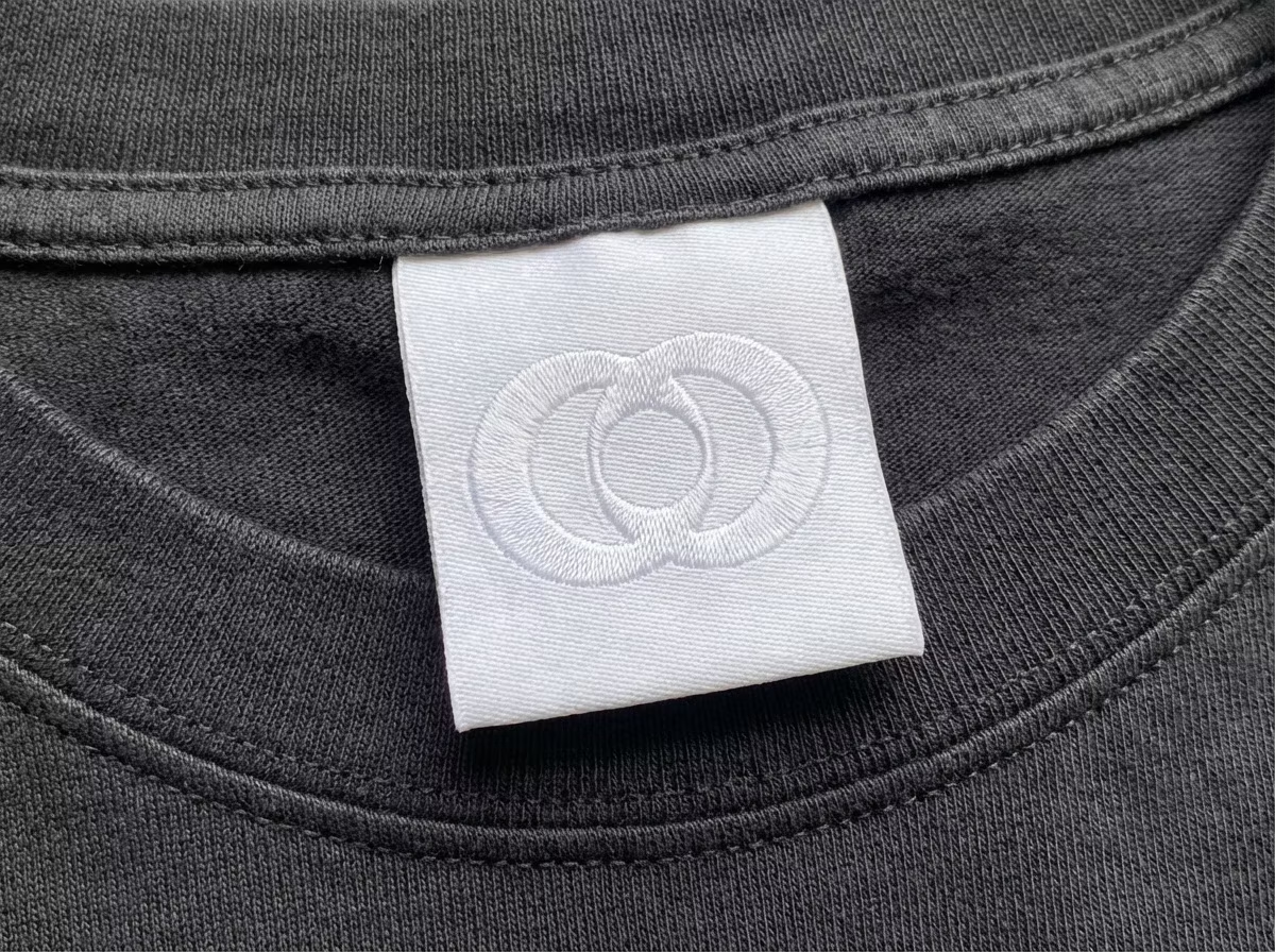
An embroidered Apeiron woven label stitched inside a grey t-shirt collar.
Document

Brand guidelines

28 pages, click to enlarge

House of Exile

DisciplineBrandingFieldFragranceYear2026

House of Exile is a gender-neutral fragrance brand inspired by natural elements like woods, herbs, smoke, and open landscapes, focusing on atmosphere and individuality rather than traditional scent categories.

Challenge

Fragrance branding leans on gendered, category-driven conventions. House of Exile needed to step outside that system and sell atmosphere and individuality instead of a familiar scent label.

Strategy

Anchor the identity in raw natural elements (woods, herbs, smoke, open landscapes) and let mood lead instead of category, keeping everything gender-neutral and evocative rather than literal.

Solution

A full brand identity built on tone and texture, positioning each scent as a place and a feeling rather than a conventional fragrance type.

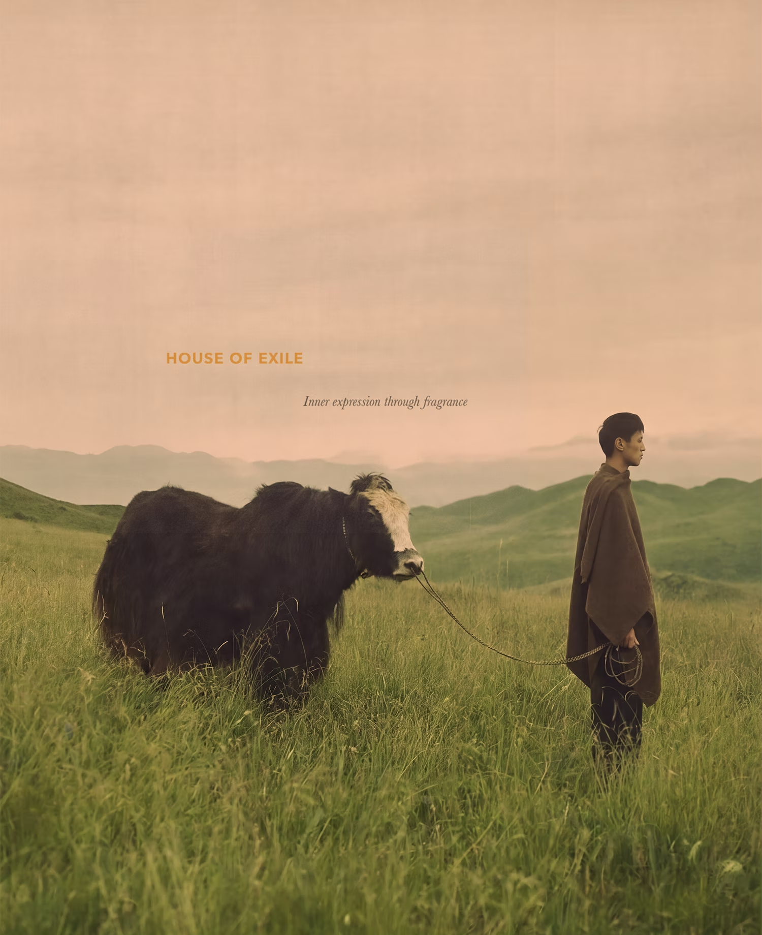
A House of Exile campaign image: a figure leading a highland cow across open grassland at dusk.
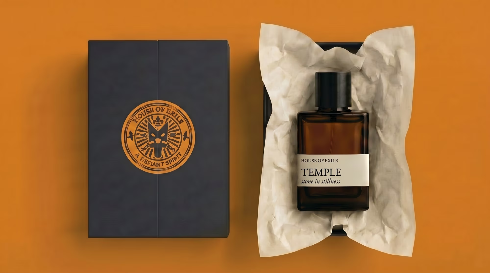
House of Exile packaging: a navy box with a gold seal beside the Temple eau de parfum on orange.
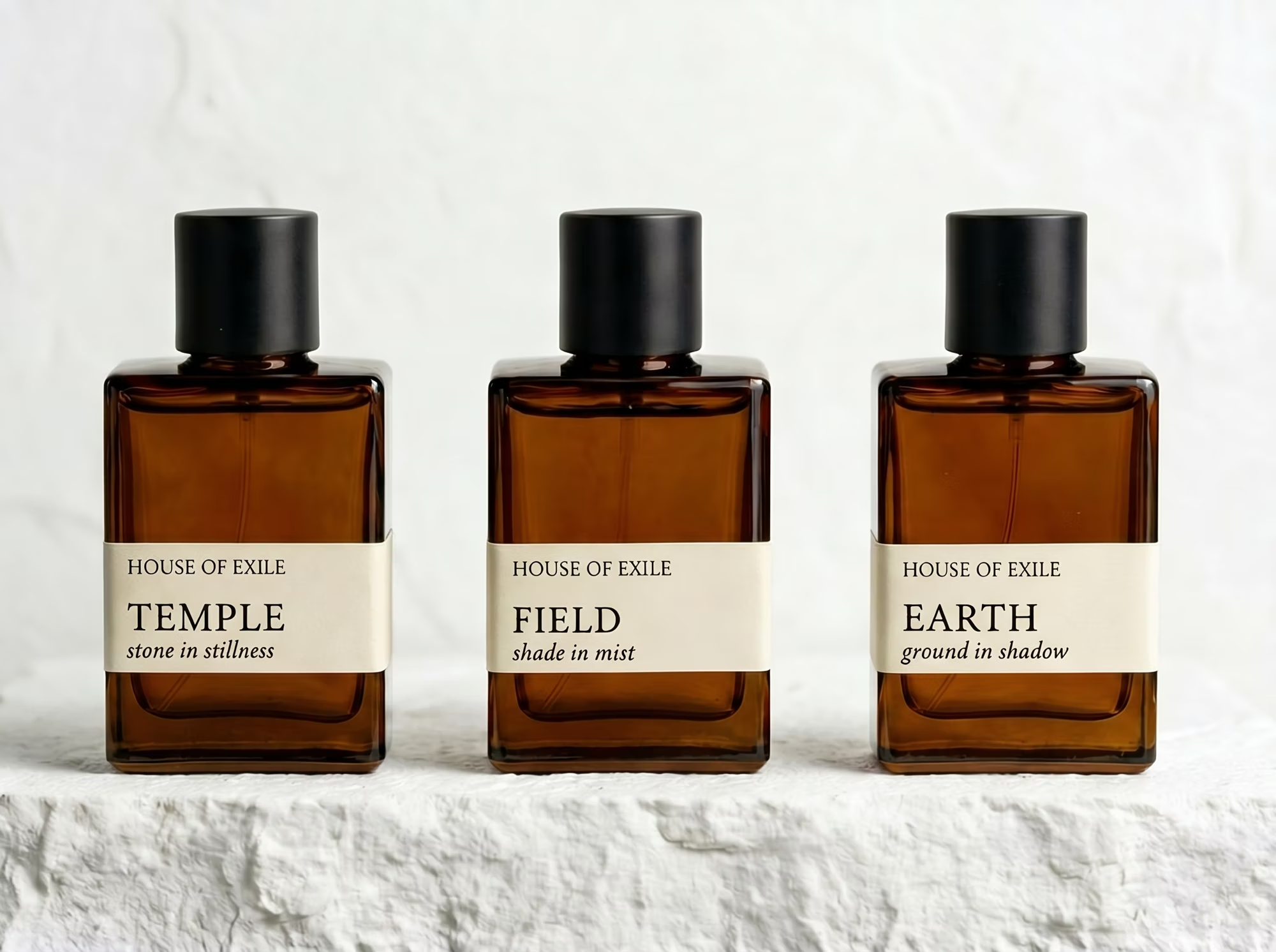
Three House of Exile bottles, Temple, Field and Earth, lined up on a white plaster ledge.
Document

Brand guidelines

17 pages, click to enlarge

4ME NOTU Biography

DisciplineBiographyFieldEditorialYear2026

This short, editorial-style biography covers the creative process of Syliss Frenchwood. A fashion-focused designer based in Phoenix, Arizona, who is the creator behind the clothing brand 4ME NOTU.

Challenge

Emerging designer Syliss Frenchwood needed a way to introduce both the person and the creative process behind 4ME NOTU, something closer to a story than a spec sheet.

Strategy

Treat it as an editorial piece rather than a bio blurb, using pacing, typography, and imagery to carry the designer's voice and Phoenix-rooted perspective.

Solution

A short, editorial-style biography that documents Frenchwood's process and frames 4ME NOTU as the work of a distinct, fashion-focused point of view.

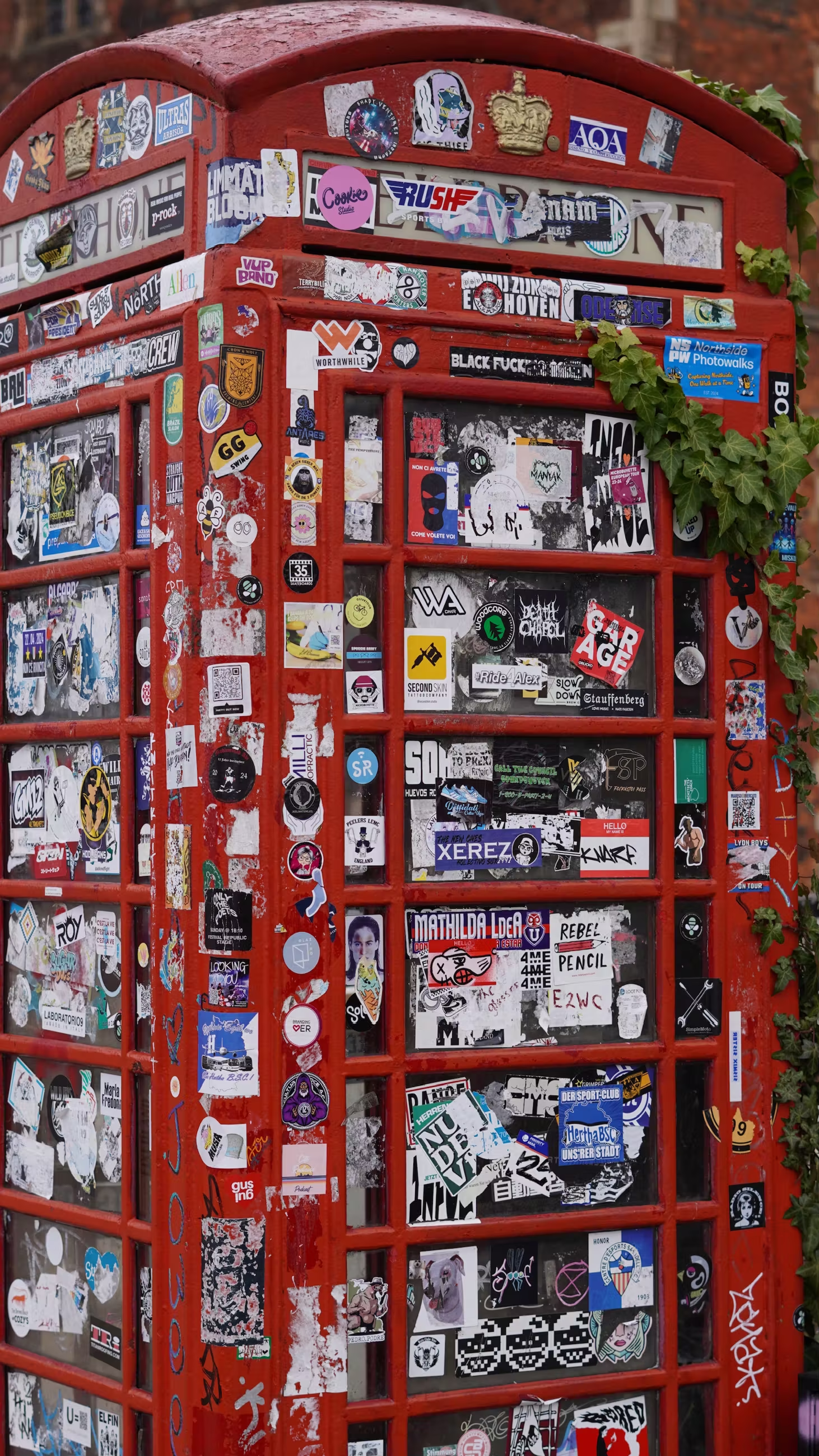
A dense wall of stickers and flyposters photographed for the 4ME NOTU biography.
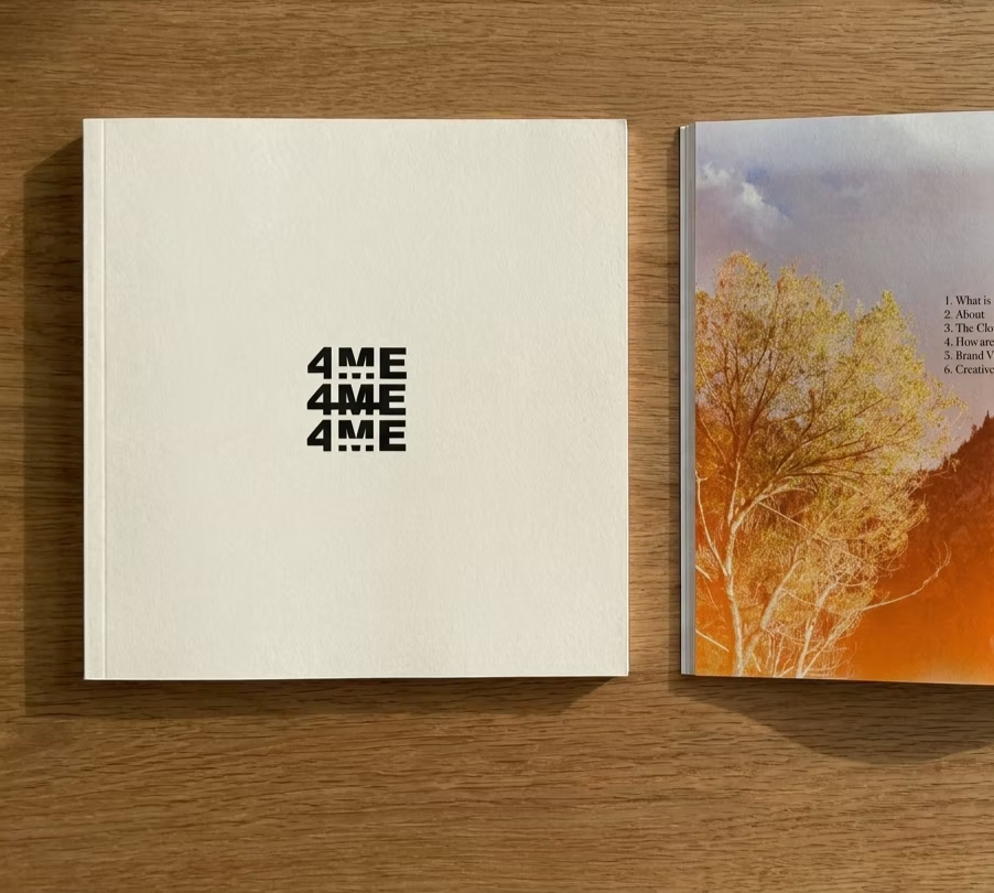
The 4ME NOTU biography: a bone cover stamped 4ME 4ME 4ME beside an open autumn spread.
An interior spread introducing designer Syliss Frenchwood in black and white.
Document

The biography

11 pages, click to enlarge

Verdant

DisciplineBrandingFieldResidentialYear2026

Verdant is an apartment chain that turns concrete blocks back into living cliffs of green. An identity, signage and campaign system for eco-friendly city apartments.

Overview

Verdant's towers keep a raw, honest structural look, but cast from carbon-sequestering hempcrete with deep board-formed grooves that hold soil, so moss and native plants slowly colonize the walls until each building reads as a stepped green mountain. Heavy cantilevered terraces on every floor hold real trees, vertical wetlands filter greywater into cascading ferns, and facades are seeded only with each city's native species to feed local birds and pollinators.

At street level

The lobby dissolves into a public, shaded forest floor of moss and benches that cools the block and cuts the urban heat-island effect, while rainwater catchment, on-site greywater recycling, solar and geothermal power, and self-feeding compost gardens make each tower net-positive.

Solution

An identity struck from concentric arcs, a growth ring, a fern crozier and a radiating signal at once, carried across signage, transit, out-of-home and print.

Identity in motion
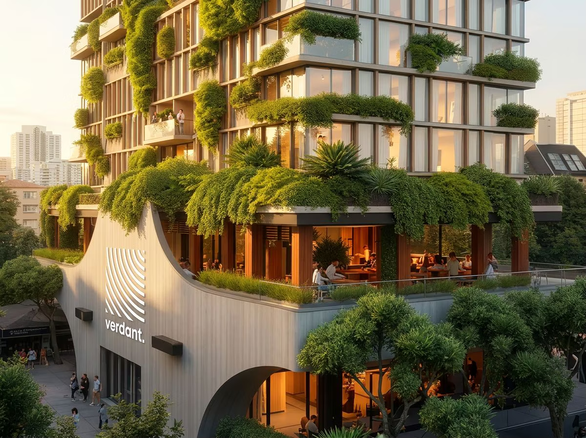
A Verdant tower: a curved board-formed hempcrete facade carrying the Verdant sign, with planted terraces spilling over a city street.
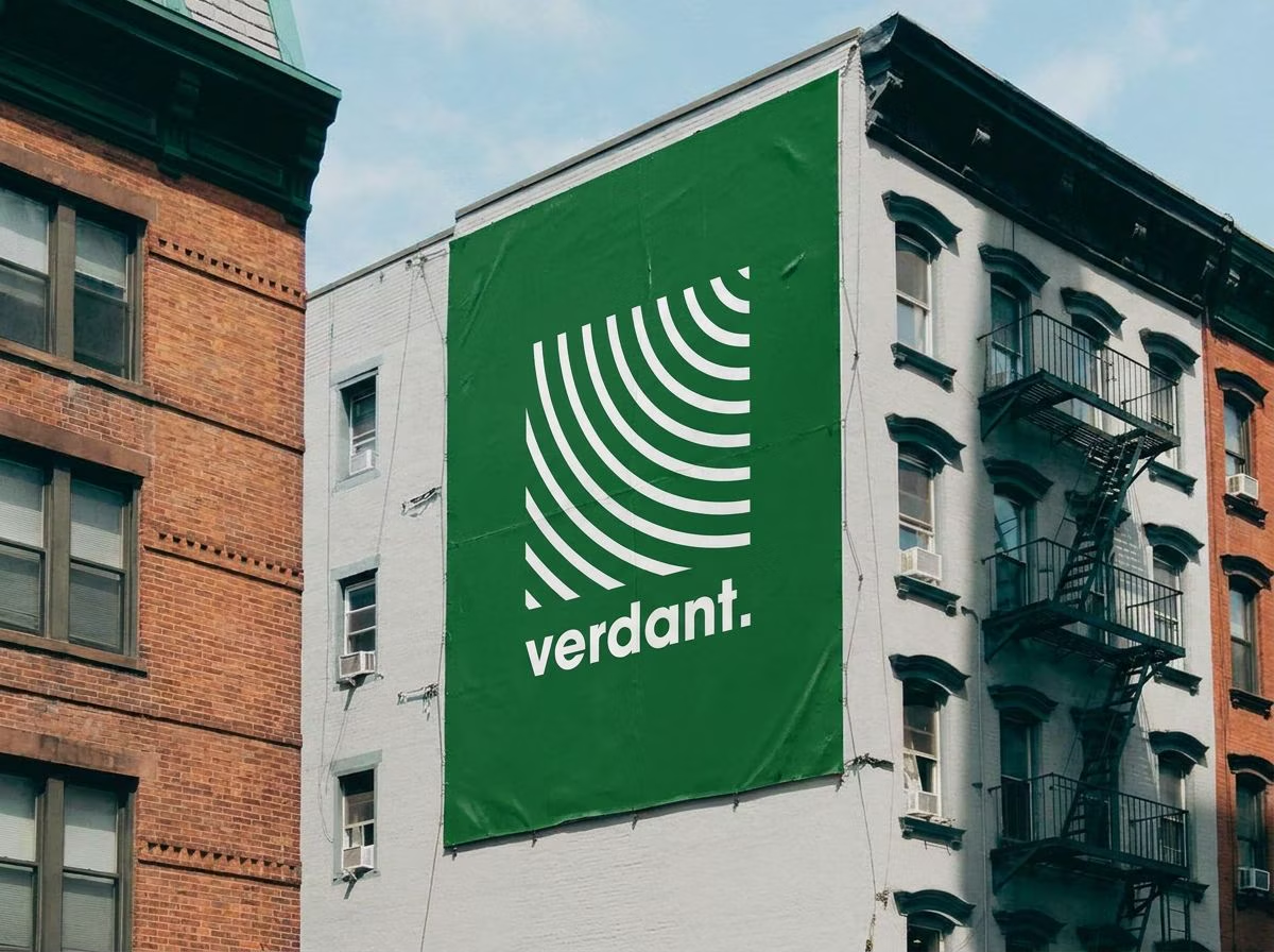
A Verdant mural pasted across a city building wall, white arc mark on forest green.
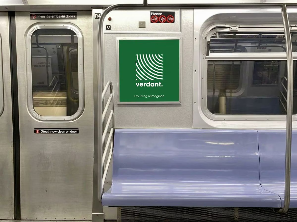
A Verdant car card inside a subway train reading 'city living reimagined'.
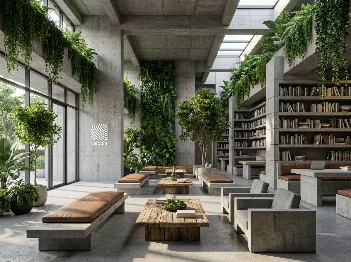
The Verdant lobby: board-formed concrete, skylights, bookshelves and dense hanging planting.
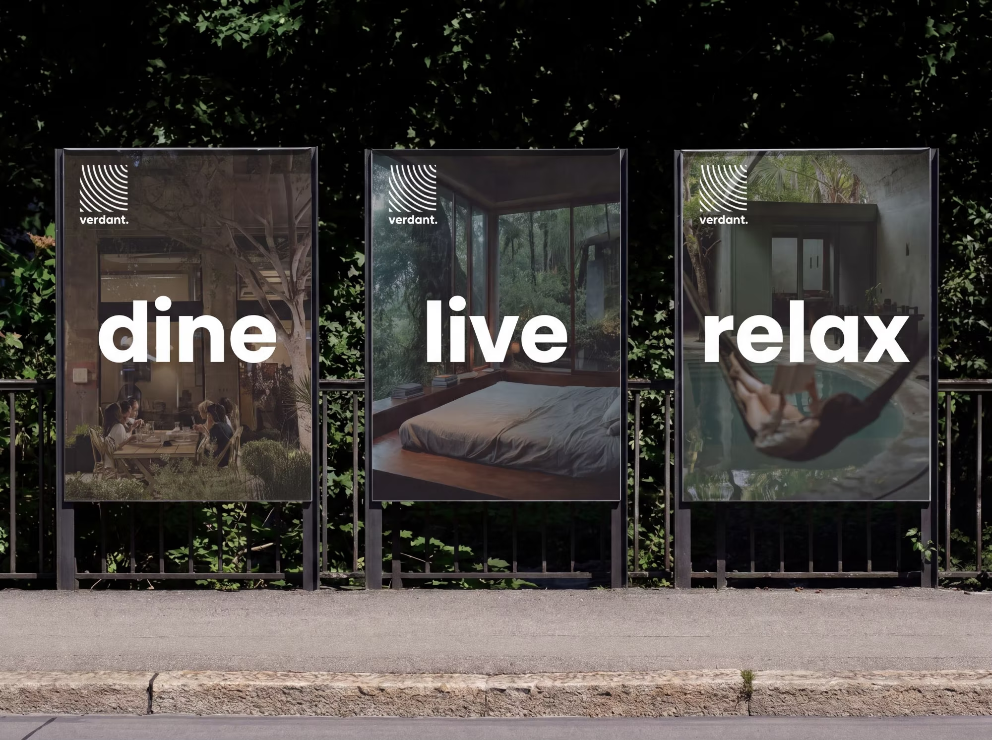
Three backlit street posters reading dine, live and relax over interior photography.
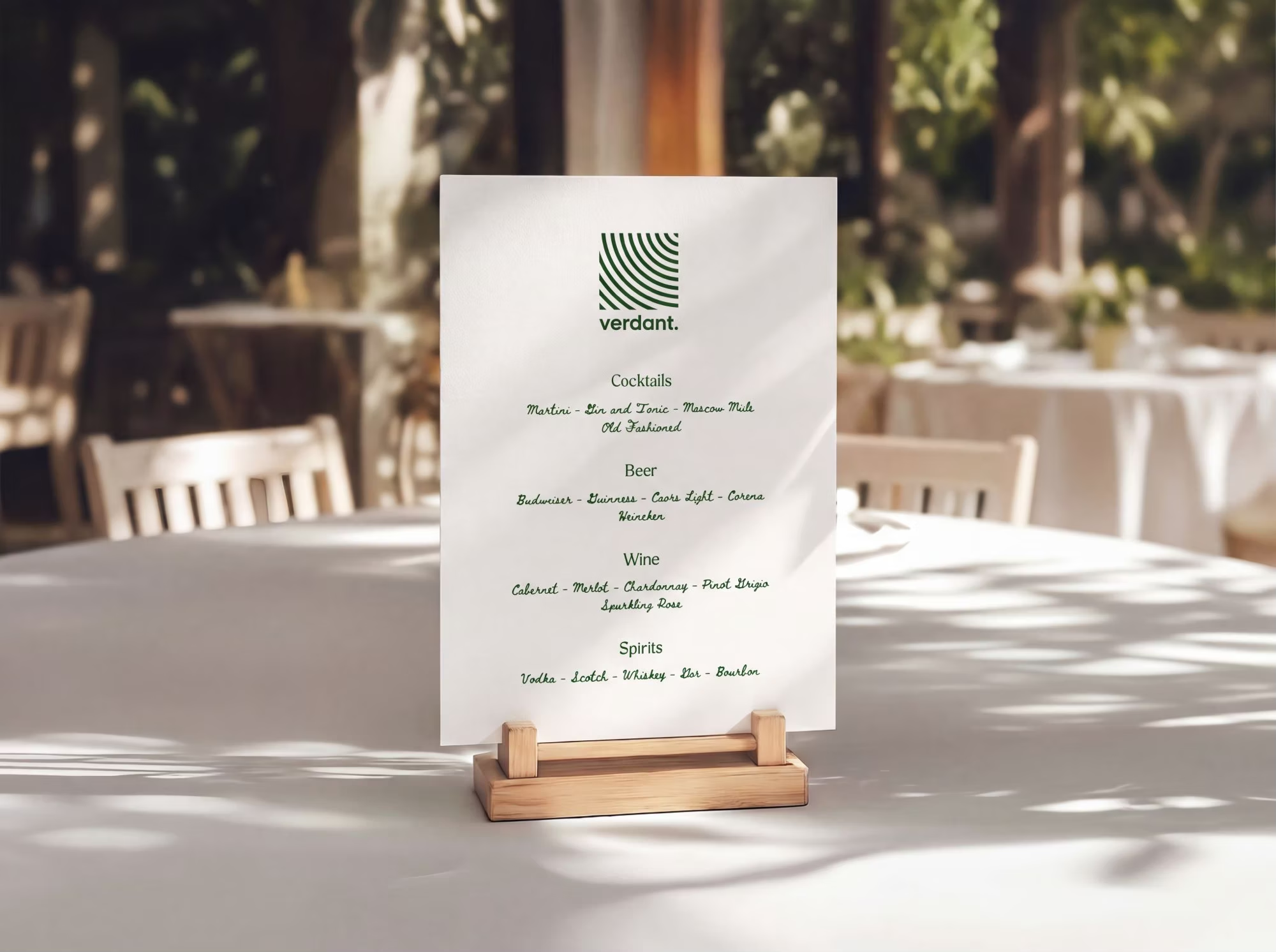
A printed Verdant bar menu on a wooden stand, listings set in green script.
Identity
Mark
Concentric arcs struck from the upper-right corner of a square: a growth ring, a fern crozier and a radiating signal at once.
Wordmark
Set lowercase in a geometric humanist sans with a full stop. Soft, civic, unshouted, the counterweight to the architecture's rawness.
Voice
One verb per panel. dine. live. relax. Never adjectives.
Rule
The mark never sits on photography without the square. The square is the clearspace.
Verdant#136734
Bone#E9E7DE
Ink#0E1112
Lichen#8E9B84

Frekja

DisciplineBrandingFieldClothingYear2025

Frekja exists to bring more freedom and feminine confidence into the Icelandic fashion space. Our designs are intentionally wearable, but the energy behind them is bold.

Challenge

The Icelandic fashion space lacked a label speaking directly to feminine confidence and freedom. Frekja needed an identity that felt bold without making the clothes themselves hard to wear.

Strategy

Split the difference on purpose: keep the garments wearable and everyday, but load the brand's language, energy, and visual voice with boldness.

Solution

A brand identity and guidelines that carry that contrast: confident, energetic branding wrapped around an accessible, wearable product line.

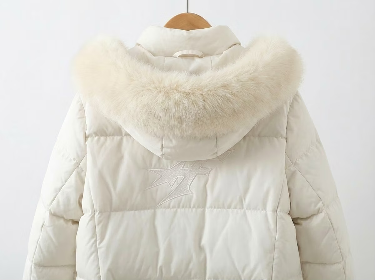
A white Frekja puffer coat with a fur-trimmed hood on a hanger.
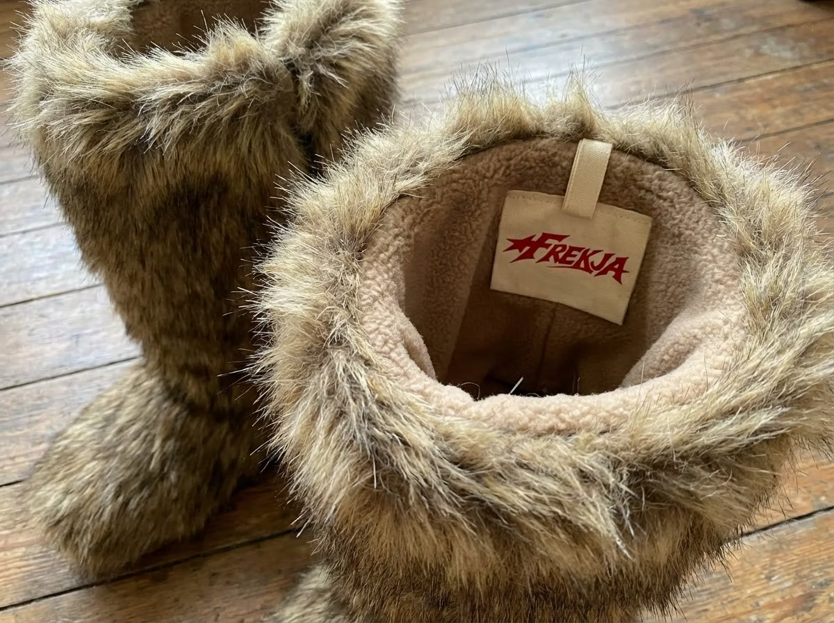
Fur-lined Frekja boots with a red branded tag.
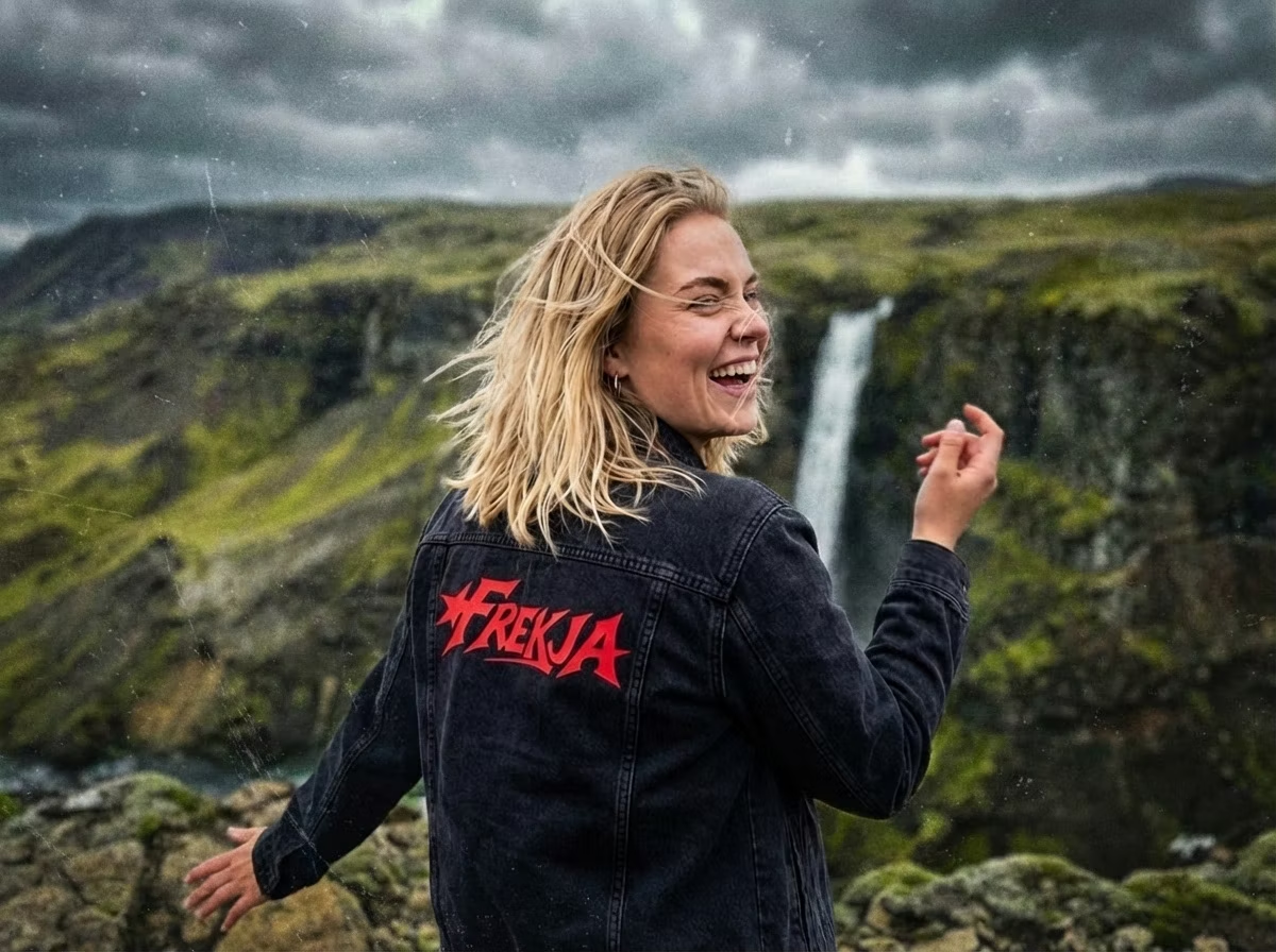
A woman in a Frekja hoodie laughing in front of an Icelandic waterfall.
Document

Brand guidelines

25 pages, click to enlarge

Cyrus Dallin Museum

ClientCyrus Dallin MuseumDisciplineExhibition cardsFieldMuseumYear2025

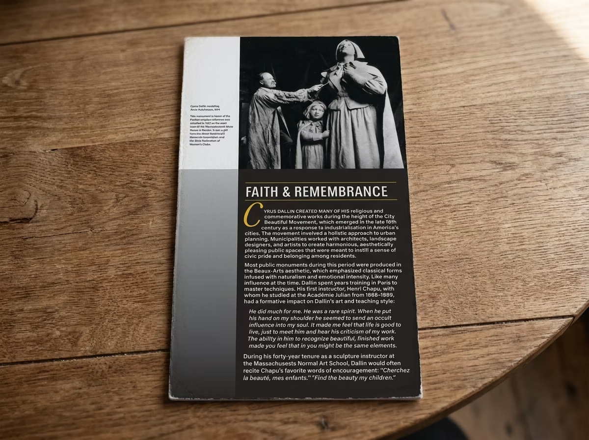
While attending Lesley University, I was an intern for the Cyrus Dallin Museum. I was tasked with creating a system of cards that describe the work on exhibition.

Challenge

As a design intern at the Cyrus Dallin Museum, I needed to help visitors understand the works on exhibition through clear, consistent interpretive materials.

Strategy

Design a repeatable system rather than one-off labels: a flexible card format that could describe any piece while staying visually unified across the exhibition.

Solution

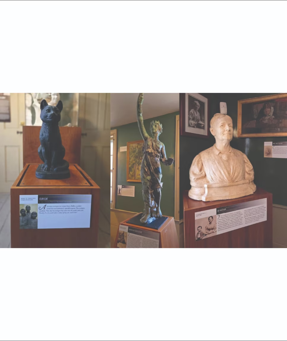
A system of exhibition cards describing the works on display, giving the museum a cohesive, reusable framework for presenting its collection.

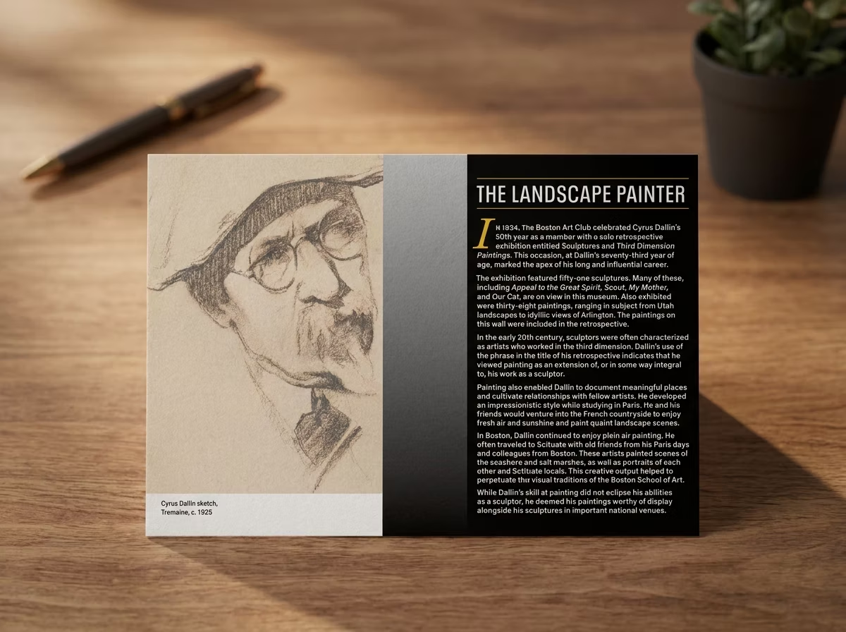
A Cyrus Dallin exhibition card, 'The Landscape Painter', lying on a desk beside a pen.
A 'Faith & Remembrance' exhibition card on a wooden table.
Sculptures on plinths in the Cyrus Dallin Museum, each with an interpretive card.

Ends Art Exchange

ClientHarvard UniversityDisciplinePosterFieldEventYear2024

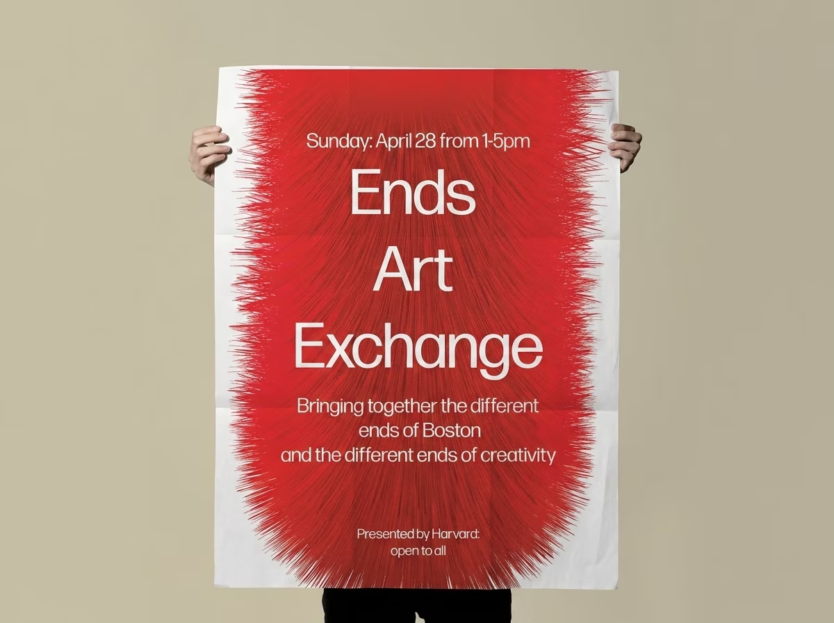
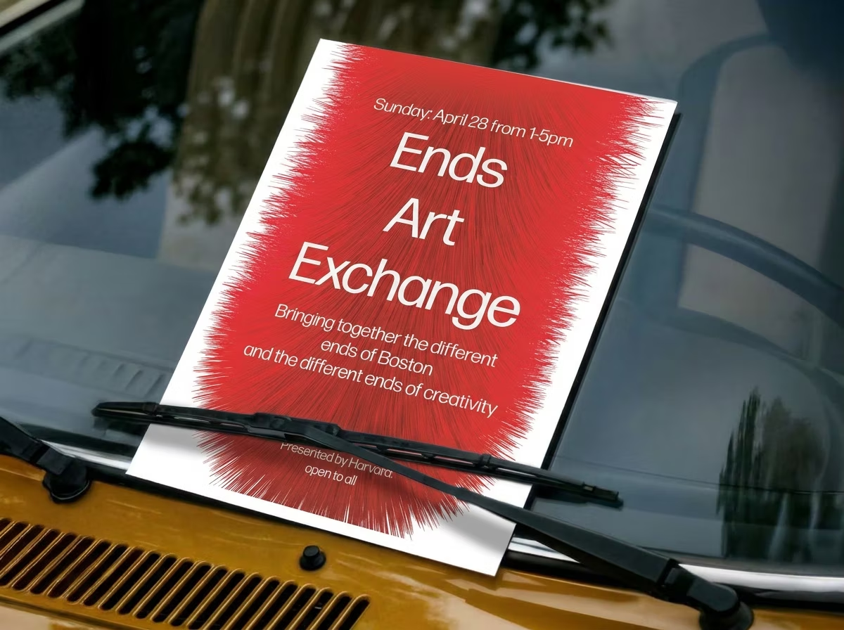
Ends Art Exchange was a Harvard-hosted event that provided students with the opportunity to purchase and exchange artwork.

Challenge

Ends Art Exchange, a Harvard-hosted event for buying and trading student artwork, needed promotion that would catch the eye of a creative, art-literate campus audience.

Strategy

Lead with a single strong poster, an art object in its own right, that signals the event's creative spirit and earns a second look on a crowded board.

Solution

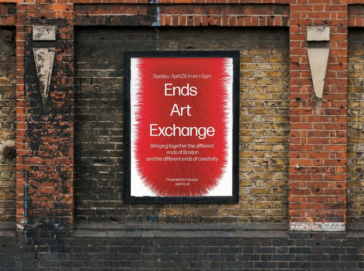
A poster that communicates the exchange clearly while holding its own visually in front of an audience that makes and critiques art.

Hands holding the Ends Art Exchange poster: a red ink burst on white.
The Ends Art Exchange poster pasted onto a brick wall.
The Ends Art Exchange poster tucked under a car windscreen wiper.

Listen

DisciplineEditorialFieldEditorialYear2024

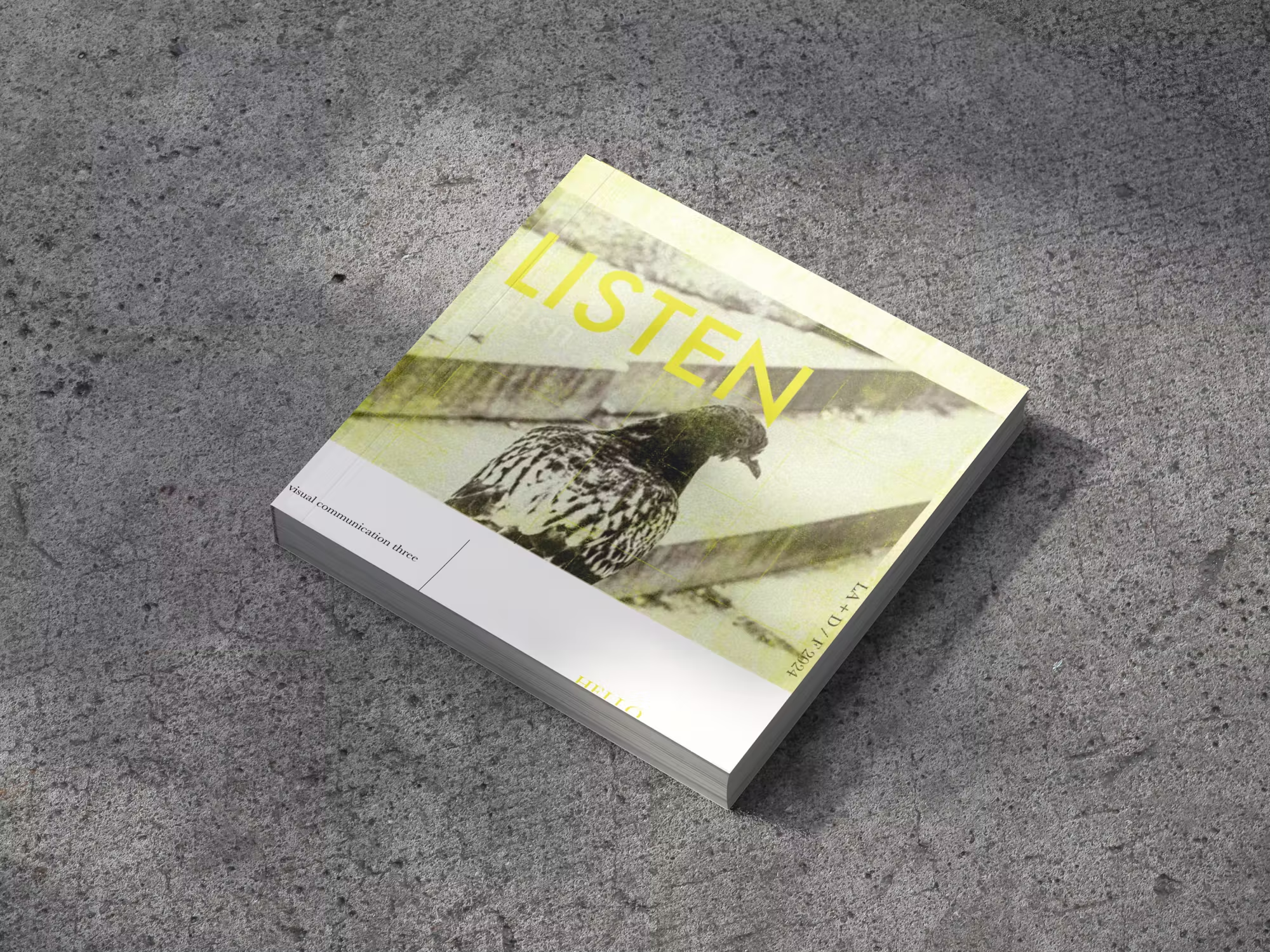
Listen was a project assigned to me during my time in college. The goal was to spend time focusing on sounds in the world around us, and bringing back our observations into an editorial.

Challenge

A college brief asked me to slow down and pay attention to the everyday sounds around me, then translate that intangible experience into print.

Strategy

Use editorial design (sequence, typography, and rhythm) to give sound a visual form, turning fleeting observation into something a reader can move through.

Solution

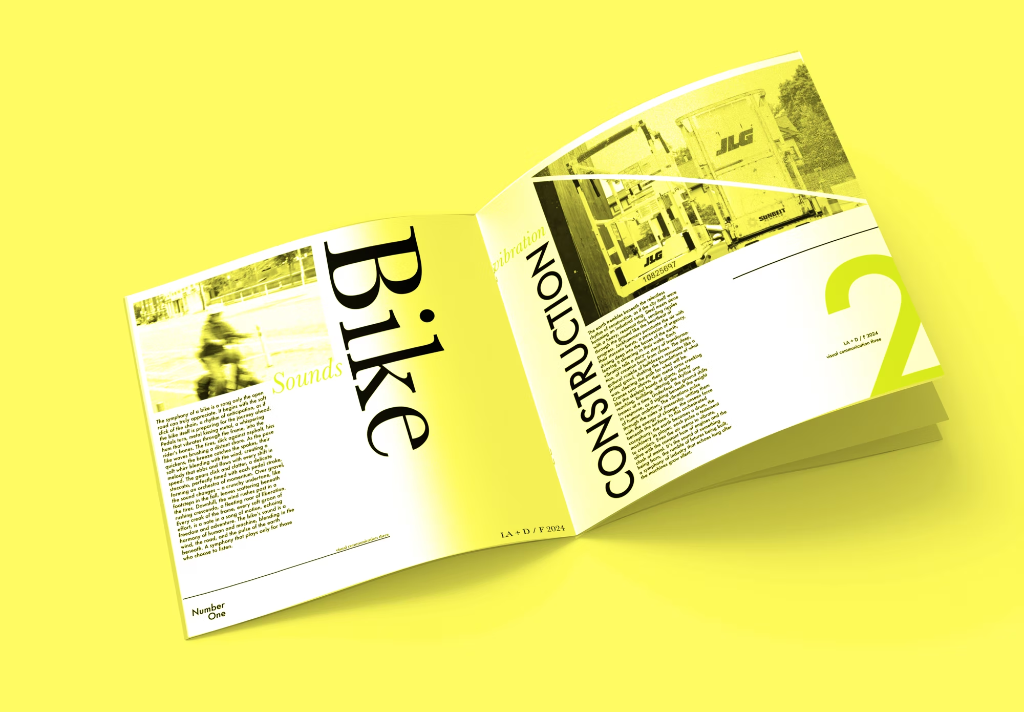
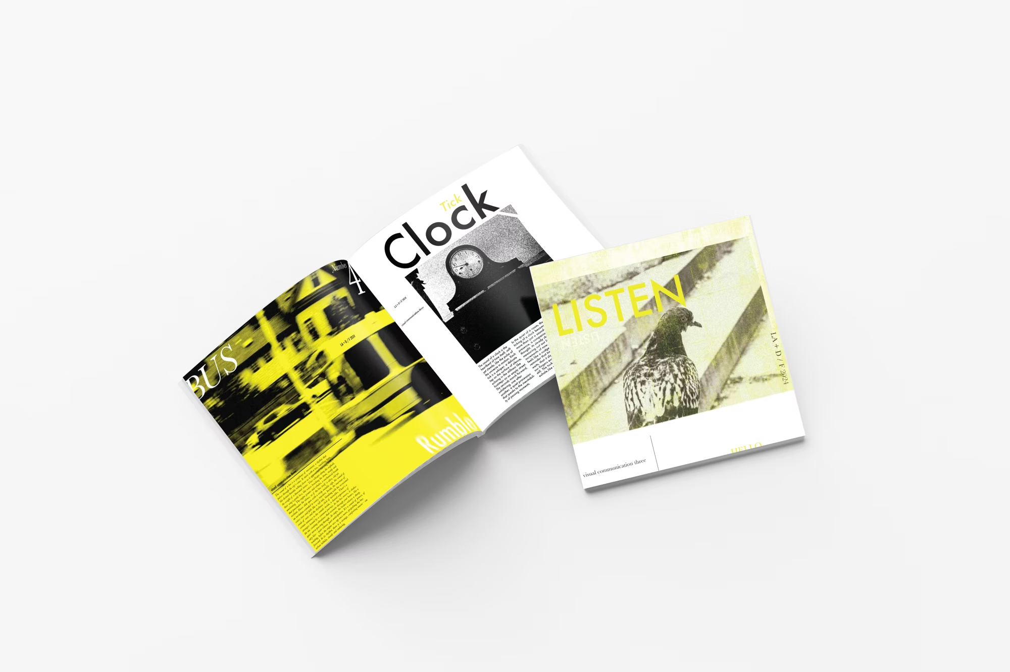
An editorial piece that captures those sonic observations on the page, translating the act of listening into a designed reading experience.

The Listen editorial, a yellow and white cover, photographed on concrete.
An open Listen spread with 'Bike' and 'Construction' typography on acid yellow.
Folded Listen inserts fanned out on a white surface.